
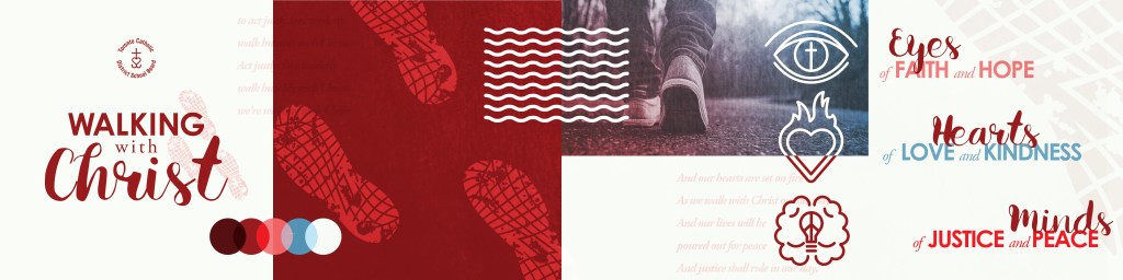
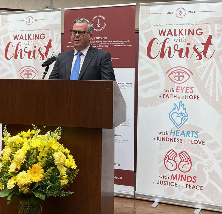
In my time at the TCDSB, I had the opportunity to create the branding and launch graphics for multiple pastoral plans. What is a “pastoral plan”? Basically, every three years a dedicated group of teachers and administrators, representing the Board’s educational and religious interests, choose a theme in which school/board activities, events and curriculum can be centred around. This theme is segmented into three separate components, one for each individual year, that then tie back into the overarching theme. After the previous campaign wound down, the new theme chosen was “Walking with Christ“, with the individual years being broken down to: with eyes of faith and hope (2021/22), with hearts of kindness and love (2022/23), with minds of justice and peace (2023/24).
As the in-house designer for the Board, I was tasked with taking all of this information and creating a coherent set of visuals that could be used as branding for not only the overarching plan but also for each individual year. Here is the process on how I reached this final product.
BACKGROUND
First thing that I should say off the top: I am not Catholic, despite working for five and half years at a Catholic school board. So when overtly religious projects would fall to my desk (which wasn’t uncommon, obviously), I took them as an opportunity to expand my skills as a designer and challenge myself to step out of my comfort zone in order to deliver the best possible work for the “client”. The client, in this case, was the team of educators assembled to develop the “plan”.
After initially meeting with the team, I got a good sense of what they were envisioning for the plan and, being one of the only creatives working for the board, I was able to offer my expertise on how to keep those ideas unique from previous years, while still adhering to the overall TCDSB brand. From these initial conversations, I was able to develop some goals for the designs:
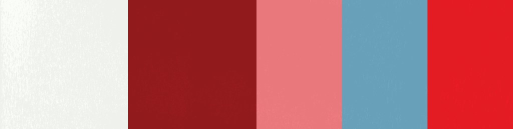
- Build on the “Board Maroon” and instill a better sense of “brightness” in the designs
- In previous years, the pastoral plan designs relied heavily on the Board’s branded maroon colour, which is quite bold and thus tended to make things “dark”; We wanted the new designs to be lighter
- Adaptability, year-over-year
- Be able to break down the designs so they can be used separately each year, as well as cohesively together
- Encompass all key elements of each individual year into multiple components of the design
- Each year has one main element (i.e. eyes) and two supporting elements (i.e. faith and hope) that should come through in both the comprehensive design and the breakdown of the individual years
- Emphasize the idea of walking and being led alongside Christ while connecting to the challenging time we are emerging from
- A key element they wanted emphasized was obviously the idea of walking, but also moving forward and hopefully beyond a very difficult and troubled period of time (the pandemic, heightened racism, unprecedented mental health issues)
- Maintain clean, consistent iconography and typography while introducing new organic textures and accent colours
- The TCDSB branding up until this point valued clean colour schemes and geometric lines; given the previous point (emerging from a tumultuous time) we wanted to add some texture which also complimented the motif of walking down a path
- Integrate input and designs from our student volunteers
- These designs were usually handled by a single person but the team really wanted to involve some student leaders in the design process this time around. Three students were selected and were to provide input and sketches to help the designs along the way
DEVELOPMENT
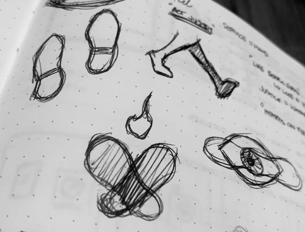
After I had all that information, we met with the students to bounce some ideas about what direction they wanted to take things. The hierarchy was basically as though they were art directors on the project and I was their CD. I pitched the idea of shoeprints playing a major part in the designs, making up the background, with the text and icons being forefront. Additionally, each of the shoeprints could represent one of the years and help emphasize the individual designs as needed. The icons themselves were to be representations of the three main symbols (eyes, heart, mind) with added “hidden” elements to subtly throw to the descriptor words. This seemed to resonate, and each student was assigned one of the years to work on.
With this plan (and eventual sketches from the students), I developed a stylescape as a jumping-off point.
A few things ultimately didn’t progress from this stage, but the bones of the entire design are there. The icon designs were based off of initial sketches from the students, though unfortunately we decided that the icon for “minds of justice and peace” wasn’t on par with the other ideas. So we evolved the eventual design. The hierarchy of fonts also wound up changing as well and the darkest colour in the scheme got left on the cutting room floor.
In the end, the feel was very close to what they wanted and it remained in the eyeline of the overall TCDSB brand.
COLOUR SCHEME
The jumping-off point for the colour scheme was always going to be the TCDSB Maroon. The supporting pink and blue colours helped compliment the branding while remaining not over powering. Once I multiplied the colours’ blending mode together, this nice vibrant red emerged as well and I thought it provided a lovely progression for the icons. Starting with the pink in the first year, progressing to a soft blue and finally to a vibrant red gave a sense of moving forward and getting back closer to that main colour. I also wanted to make sure that the maroon was not as dominant as previous years, and wanted white space to help lighten things up. Flat white didn’t quite work though, so a very slight off-white helped warm the look and worked better with the grungy texture.
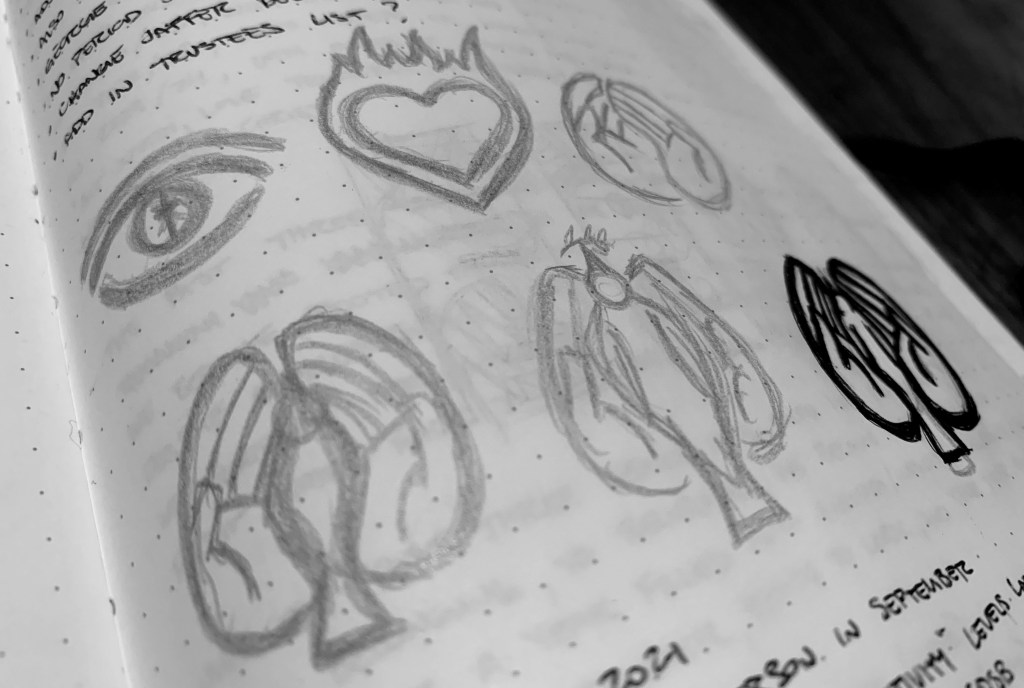
ICON DESIGNS
After having the students present their sketches, I had the formidable job of being able to wrangle these designs to include a representation of each of the three elements for all three years. I decided that the TCDSB illustration style that I had developed previously would work well for the individual year icons and used that as my starting point. I figured these clean, geometric lines would pair nicely with the more organic and textured shoeprints we were planning to use in the background. This tied back to the TCDSB brand in a cohesive way.
The icons had to be recognizable for what they were representing, so making them literal worked best. As mentioned, the original “minds of justice and peace” design just wasn’t going over well and so we had to scrap the student’s design and build something different. I did like the idea of having two pieces merge to create a similar shape to a brain. After some consultation with the team, understanding that they almost chose to have the third year called “with hands of justice and peace”, I thought the cupped hands merged those two entities well. Being able to add the subtle dove, hidden amongst the lines of the fingers was a clever way to incorporate the peace angle as well. The above graphic explains the thought process behind all of the elements taken into consideration.
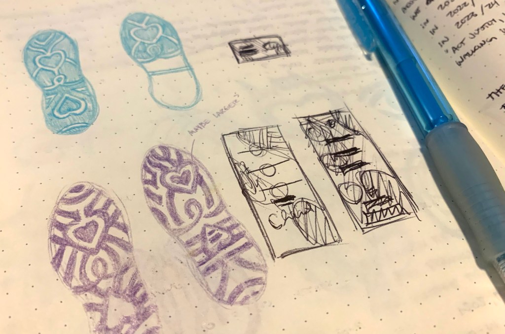
SHOEPRINT DESIGNS
The decision was made to also make the shoe prints unique and representative of each individual year. This helped to be able to break the designs up and use a single shoeprint each year of the plan or use all three together as needed. The students were also tasked with providing sketches and I did my best to make sure their ideas were included in the final designs. Each shoe once again depicts the three elements of each individual year with the patterns and tread complimenting those ideas.
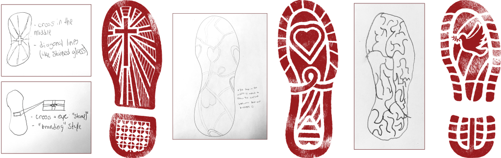
I decided it would be beneficial to evolve the types of shoes the prints would represent with each passing year. Make the designs move from more of a loafer in the first year (easing yourself around) to an all out runner by the third year (ready to run again). In a nod to the previous pastoral plan, I also decided to add in the three elements of the Board logo (the cross, the heart, the anchor). Having one of these on each subsequent design helped further the idea of progression and moving forward, while ultimately tying it all back to the TCDSB’s own mission.
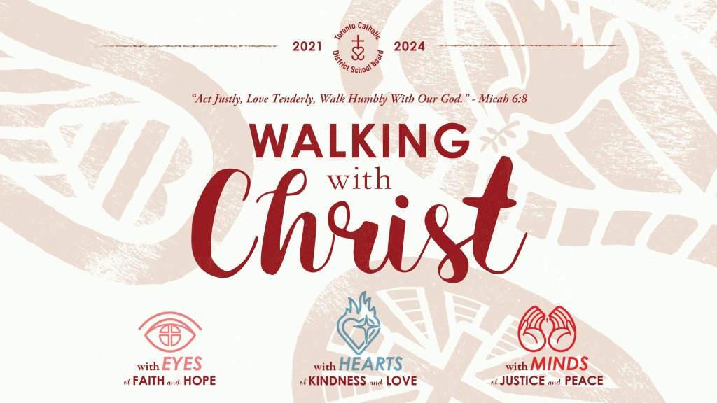
FINAL DESIGNS
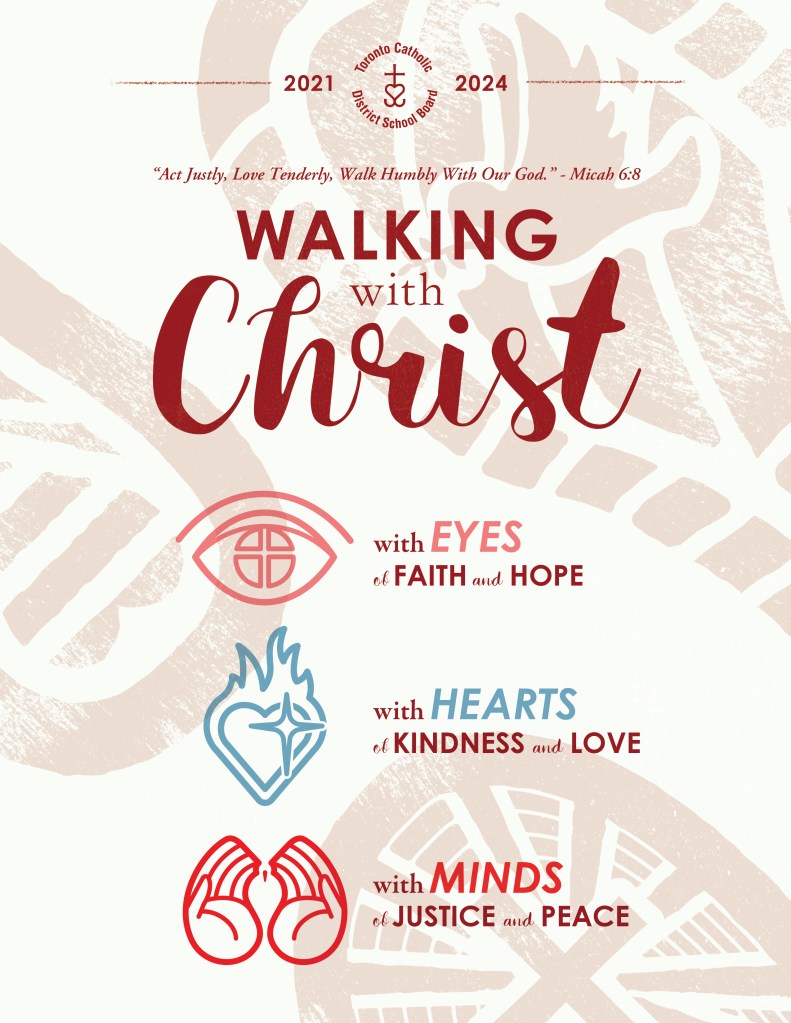
Given all the detail that needed to be included in the individual designs, putting everything together could have been a challenge. Luckily, having the stylescape to work from made everything slightly easier to visualize. The fonts used on the final utilized two of the typefaces already in use from the Board’s style guide I had developed years previous (Century Gothic and Garamond). The addition of the “handwritten” Karla Script added a much needed flair to the displays, creating a nice harmony with the calculated geometry of Century Gothic – akin to the meshing of styles between the clean icons and textured footprints.
The main piece that I worked towards was a banner, as I knew this would be a prominent aspect of how the designs would be used. After I sent in what I believed to be the final layout, there was pushback on the hierarchy of the different elements as well as some of the “white space” being displayed. After pleading my case as to why those design decisions were made, there were a few minor tweaks to the placement of elements, but the finals stayed close enough to what I initially presented.
LAUNCH TRAILER
Once the designs were finalized, it also fell on me to create a short trailer that could be played at the year-end celebration/conclusion of the final year of the previous pastoral plan. This would serve as a starting point for the Walking with Christ campaign and get the school communities excited for what was ahead in the years to come. I wanted to make sure there was that sense of texture seen in the print/digital designs while keeping everything smooth from an editing standpoint, to keep that balance between the two. I wanted to match the same energy of “stepping forward” and moving towards something good that I tried to convey in the flat designs. The animations of the individual years were also the first examples of how the visuals could look broken apart from the main design, which I was glad that I got to do before I left.
FINAL THOUGHTS
This was an at-times frustrating, but rewarding project. It was a welcome experience to be able to work alongside students and let them be a part of the design process, despite needing to wrangle literally dozens of ideas into one coherent design. My “not-being-Catholic” often had to be pushed aside in order to deliver on the set goals, but I think the final creative did a nice job of emphasizing the educational components of the plan, right alongside the religious ones. I obviously did not incorporate every creative decision/challenge that went into this project, but if there’s anything that was unclear or would like further information on, please feel free to get in touch!
