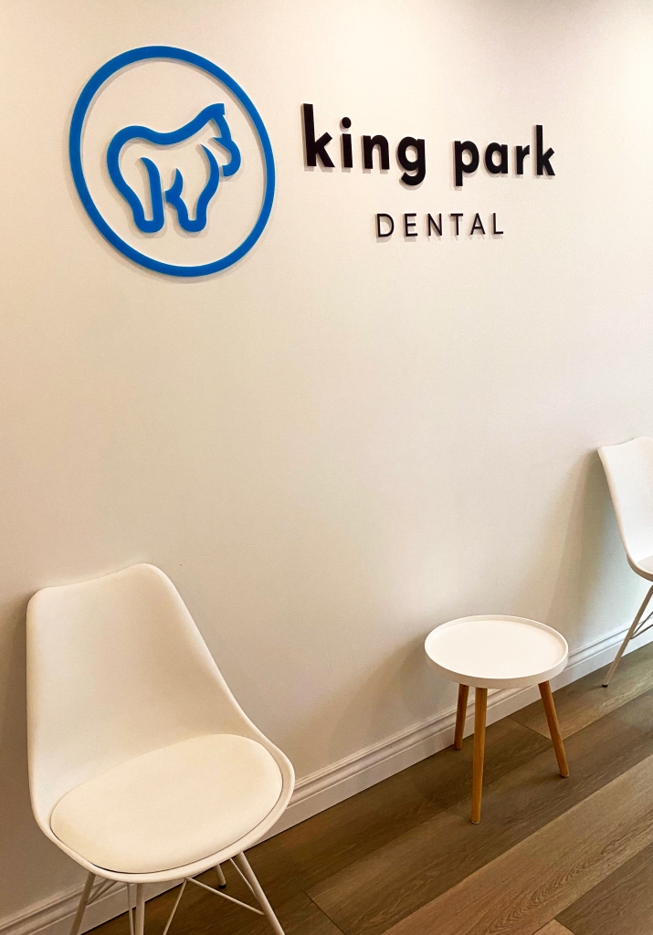
King Park Dental reached out to me about refreshing their logo, to create something more graphic than the simple “KP” they had been using previously. They wanted to have something a little more playful, and they wanted to emphasize that their practice was run by Dr. Kim and Dr. Kong. Kim & Kong. KING KONG!
Logo


With such a great starting point, I happily took their idea to combine a tooth and a gorilla and ran with it. Above is the final logo that is slowly being run out, and I was also able to sneak a split letter “K” in there, representing not only the King Park practice, but also the two Dr. K’s who run the place. From my understanding, they hope to open more practices in the future, so hopefully the logo will be seen across more than a few locations in Ontario in coming years.